Logo
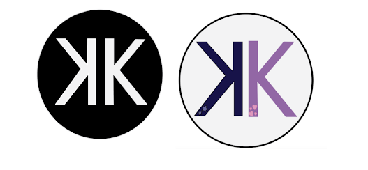
Hi everyone! Attached above are my final logos in color and B&W. I wanted to do something simple but also show certain aspects of my personality. I chose to do the K's in two different colors, one dark, and one light, explaining the different phases of my life. In the mood boards below, two of my traits were 'centered' and 'kind.' I feel that the two K's can be the mood for each. 'Centered' reminds me of the night, so I did a dark K with two stars, and the 'kind' was more light and fun with hearts to represent the love I have in my heart for others. While I didn't draw a logo to match the initial mood boards, I wanted to have my first initial center stage. When I think of a logo's especially one for an individual, I wanted to make it timeless and simple. The two K's back to back will allow me to create several different color combos as time goes on, and my personality evolves. As seen in the black and white, it can be super mature and straightforward, where the color versions can be more playful and youthlike.
Below are my mood boards that helped me create the design above:


Kayla, I really like your logo. You kept it very simple but it still gets the point across which is great. Your logo reminds me of fresh kitchen lol. I would not change a thing about your logo, you did a phenomenal job. Keep up the great work!
ReplyDeleteI have to agree with James. I believe that since your logo was simple and modern, it paired well with adding it on to your future projects. I can see your logo being used in the real world (like fresh kitchen) and I hope you plan on using it in the future! Great job!
ReplyDelete